Written by DJ Francis | 5 min read
How Spotify’s UI/UX elevated their empire over music

Spotify is one of the most used and recognizable apps on the planet. I use Spotify almost every day. When it comes to a music app, spotify is the ultimate all in one audio app. How did Spotify become as popular as it did? In order to become as popular as it is, it has to be fundamentally sound in all departments. The User Interface (UI) and User Experience (UX) is one of the departments that Spotify shines in. Spotify's large song archive and excellent UI and UX design have made it a major participant in the digital music streaming market. What features of the UI and UX are strong points?
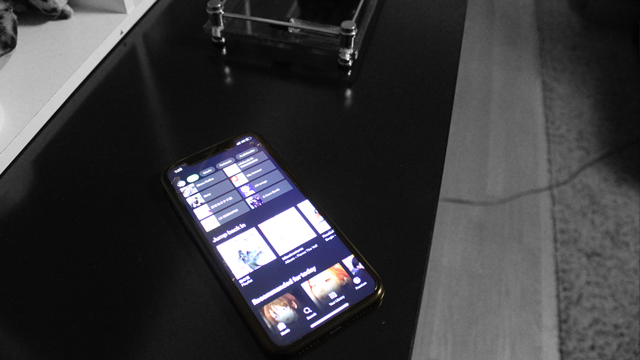
Spotify's navigation is extremely intuitive from the columns on the right and left sides being ones that display essential information. Seeing what song is playing at all times is important. This feature can be seen on the bottom of the screen on the mobile version. Personalized recommendations are how well the company has created a platform that appeals to music lovers all around the world. These personalized recommendations are also designed beautifully from the custom cover arts of the albums to the song list with clean white typography on a black background. Let's look at how Spotify's UI and UX design produces a comfortable listening experience.
One of Spotify's biggest features is its easy-to-use navigation system, which makes it simple for users to search for and discover music. The platform's straightforward and understated UI makes it easy for users to access key features like playlists, artists, albums, and podcasts with only a few touches or clicks. The UI of Spotify offers a smooth browsing experience that keeps users interested and engrossed in their musical journey, whether they are looking for a specific song or discovering new music recommendations.
According to Tracy Gardner, Global Chief Marketing Office at vlink, The UI andUX design of Spotify has completely changed the way we interact with music and audio material. This investigation will investigate the fascinating story of how Spotify's UI-UX design drew in viewers and kept them interested.
Spotify's powerful recommendation engine, which evaluates listener preferences, past activity, and behavior to provide tailored recommendations, is at the center of the platform's UX design. From Discover Weekly playlists to Daily Mixes tailored to individual tastes, Their success is mostly because of music. Their libraries are unrivaled however, their UI/UX design has also been crucial to their rise.
Spotify has stood the test of time so far. Spotify’s features make the experience intuitive for both navigation, seemingly integration with multiple platforms, and different UI layouts for different devices. I even saw an MKBHD video on YouTube about an AI device separate from your phone which has an integrated Spotify UI on it. It will be interesting to see how the UI and UX of Spotify continues to evolve and prosper or ultimately fall and get left behind in this rapidly changing field.

Hey! Im DJ Francis
l always strive to create work that not only represents me as a designer but also me as a person. My goal is to solve problems in the real world through design and to make things more intuitive and easy to use through clean minimal design. This is just the beginning of my graphic design journey and I am excited to leave lasting impressions on the world!
Feel free to reach out! Have any questions or want to connect? I’m always willing to talk and I love meeting people and creating new opportunities. Click the button below or go to the about page to reach out!
