
UI/UX
FIgma
Nov-Dec 23
Emulating and Elevating Design
"Everything is designed. Few things are designed well." Brian Reed
Overview
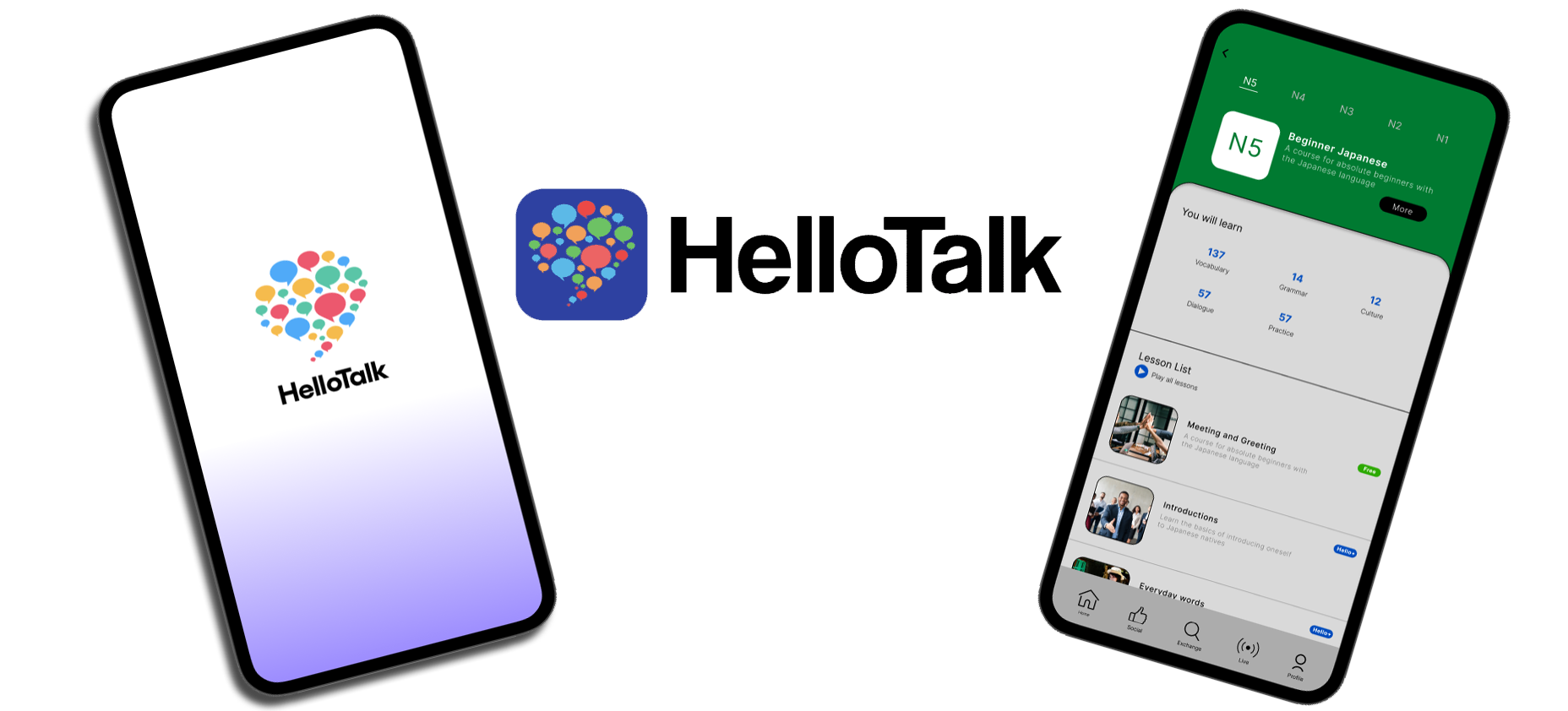
HelloTalk is a platform where users learn and practice languages and share culture with people around the world. With HelloTalk, you pick the language you want to learn, and instantaneously you're learning and practicing with native speakers of that language.
Objective
In order to become fluent at a native level, you need to interact with natives. The reason HelloTalk is an essential app for serious language learners is because it allows for language exchange, culture exchange, and making friends. However the design of the existing app can limit the accessibility to take your language skills to the next level. That is where I came in to fix that aspect of the mobile application.
Outcome
Hello talk now has a more intuitive and user friendly design. The design language of hello talk is consistent throughout the entire app.
The Start
As an avid user I identified the problems the app already had. I utilized a user-friendly design approach which allowed me to highlight the issues that needed to be addressed. I referenced the 5 steps of design thinking to come up with a good approach
I asked myself
Who is the target audience
What specifics are missing from the Japanese side of app
What quality of life changes would users want
What changes are mandatory for a better user experience
Empathize

Define

Ideate

Prototype

Test
Empathize
During the Empathize phase, I surveyed other users of the app varying to different degrees of usage rate. I conducted user interviews about the pain points of the graphical style of the app, the user interface of the app, and the features of the app
Points of emphasis
1
2
3
4
Design feels outdated
Information is redundant
Lacks basic functioning in certain areas
Does not use the standard leveling system for the respective language
Visual Research
Competition
Modern UI UX Design
Official language rankings
User Interviews
Information redundancy
“Read more” button
User friendly
Points of emphasis
1
2
3
4
In order to conduct research as to what my design was lacking to improve UX I polled users on what they thought the app was missing and or what they app could improve upon. This was critical in understanding the already existing user base. With an understanding of the user base, I could get a sense of direction on where to start in the redesign.
“I cant navigate through my profile”
“The information feels overwhelming”
“There are a lot of things happening at once”
“I wish the lessons were more intuitive”
Define
During this phase, I looked at my research in order to understands the points to emphasis. In order to do so, I defined pain points for my design to address, made user personas to pin point the target audience.

Common Pain Points
Cluttered UI with a lot of redundancy
No “view more” button for parts with lengthy body copy
No uses of the official language test ranking system (for Japanese)
outdated language
User Interviews
In order to conduct research as to what I could use to improve the already existing design, I asked users who already use the app questions to see if their problems with the app aligned with my own and to see if there were other problems that I may have overlooked or have not yet encountered. This was critical for a solid foundation in the redesigning process. The questions I decided to ask were about the features that cause too much friction between the user and the app.
Questions
Do you feel a lack in design consistency
What is one thing you dislike the most about Hello talk
Do you feel overwhelmed with the amount of things on screen at a time
What features would you like to see on a future update
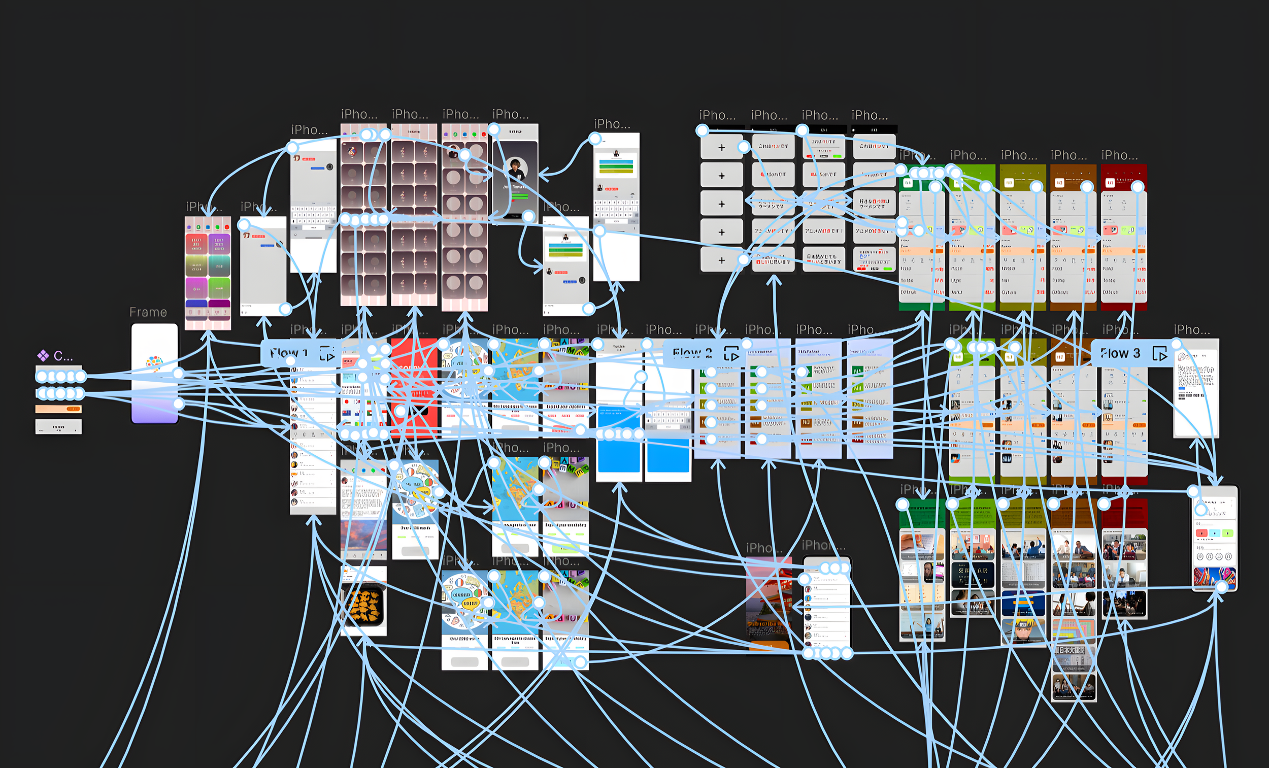
Low-fidelity wireframes
Mid-fidelity wireframes

Common Answers
The consistency of the overall design is fine
The lessons page is poorly organized
There are a lot of icons and such on the profile page that clutters it
No uses of the official language test ranking system (for Japanese)
There is no “view more” button on certain parts of the app

Ideate
In order to conduct research as to what my design was lacking to improve UX I polled users on what they thought the app was missing and or what they app could improve upon. This was critical in understanding the already existing user base. With an understanding of the user base, I could get a sense of direction on where to start in the redesign.
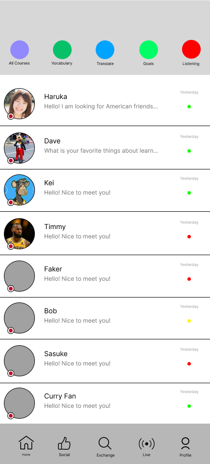
UI Kit

High-fidelity wireframes
Test
I conducted a second round of user testing to see how people interacted with the new app design and adjusted the final product to fix all the issues and incorporate all of the feedback that was given.
Rules of the testing
I asked a group of already existing users and a new group of individuals to go through the app without my guidance. This was done to see the real issues that are not intuitive enough. Users might not be completely honest so they will not come off as rude so this was a great way to see what needed to be changed.
Feedback
The navigation bar is too small
Add a flashcard system to make the app an all in one language learning app
The navigation bar is too similar in color to some of the backgrounds
Good job paying attention to the detailed of the language
Overall outcomes
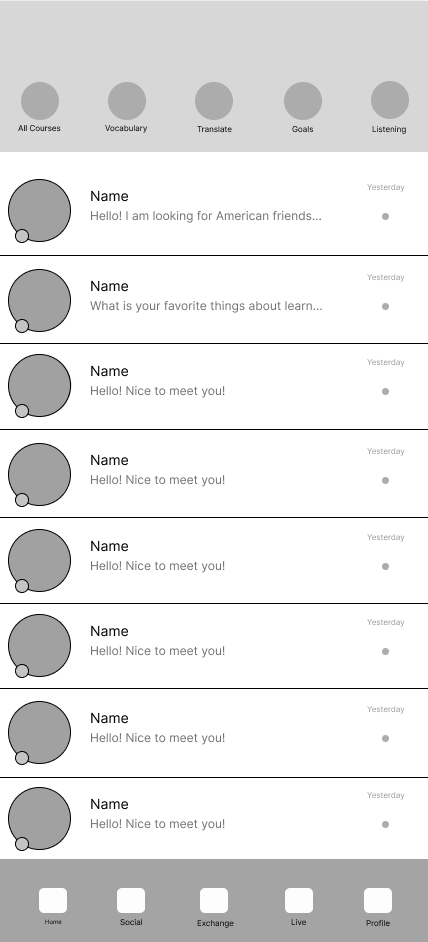
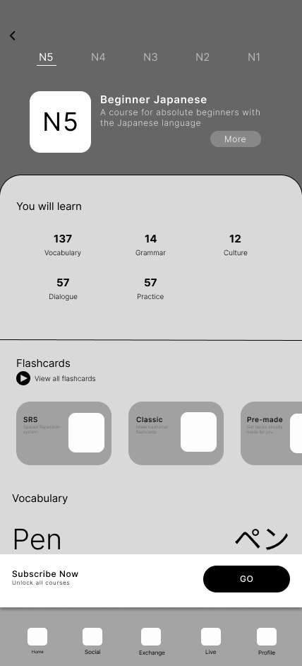
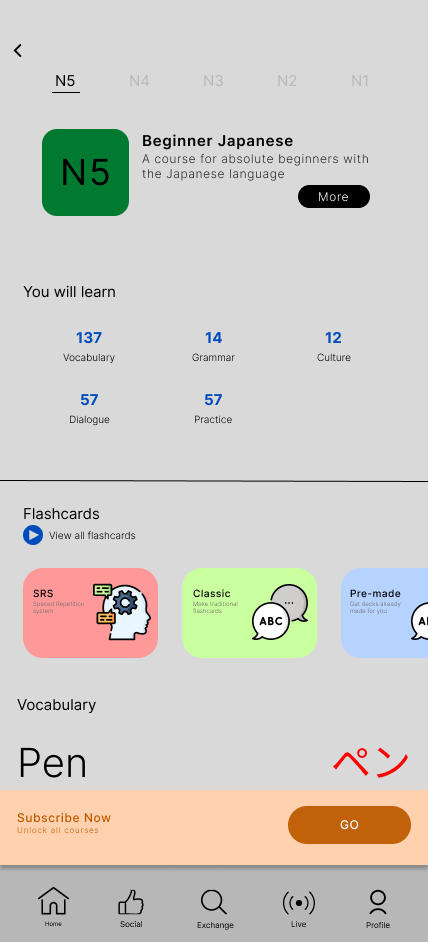
The levels of difficulty were color coordinated from Beginner (N5 for Japanese) green to advanced (N1 for japanese) red
You can see what is expected with each level N5 thought N1 and can read more about each level if they reader wants to

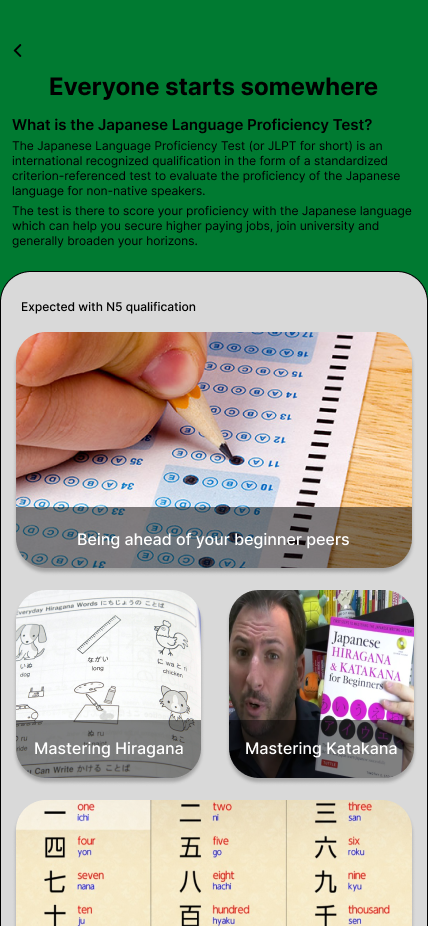
The correct leveling system for Japanese was brought to the app. This allows for people striving to take the JLPT (Japanese Language Proficiency Test) to study things on their level to better prepare.
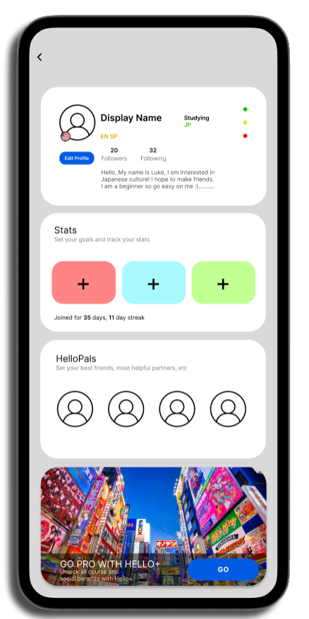
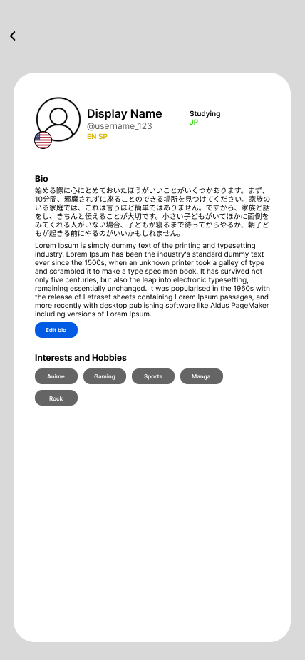
The profile sections has way less clutter and its clean with only the important information you or a viewer of your account would need to see

RETROSPECTIVE
Working on the hello talk app redesign was a very fun experience and I learned a lot about the overall experience of designing for mobile. I want to do my part in changing the world through making more intuitive and accessible designs for apps. As someone who studies Japanese, I came across hello talk for language exchange and while I loved the app I noticed right away there could be some improvements to the app. It was a pleasure attempting to solve the issues inside of the Hello talk app. I wish I could have worked on it more, however due to the time constraints of being a full time graphic design student I did the best I could. I would love to give this another shot because I know I can do better. I have always improved in everything I've done the more I've done it and as a first attempt at developing an app, I am proud of what I was able to do.