
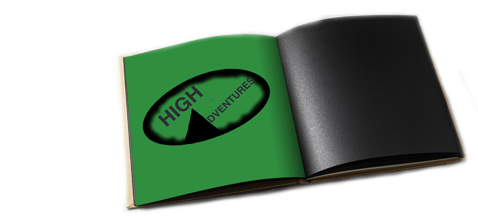
High Adventures Camp Booklet
"Everything is designed. Few things are designed well." Brian Reed

Overview
This project was about creating a booklet for a hypothetical camping company called High Adventures.
Objective
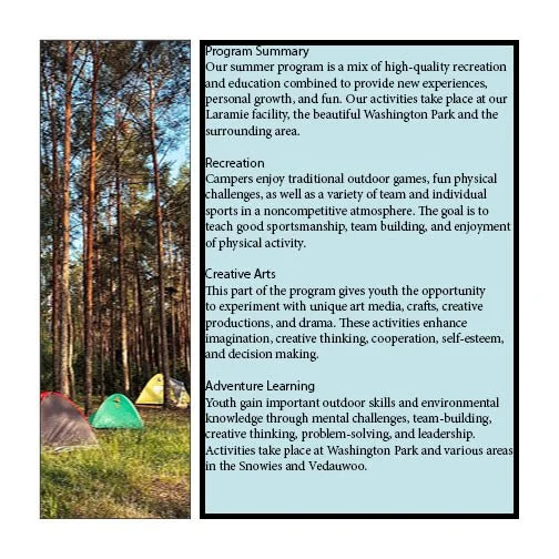
In order to have a good experience during your camping trip, it would be a good idea to have a booklet that tells you what you need to bring, a program summary of the entire thing to get you prepared for anything that gets thrown your way. I think that it is important as a designer to make every experience memorable.
Outcome
High adventures camp now has a booklet to hand out which could increase the people who decide to go
The Start
I identified who would be the people seeing this booklet. What information would I need to get across? I wanted the design of the book to be simple so readability would be easy. I utilized a user-friendly design approach which allowed me to highlight the issues that needed to be addressed. The starting question I asked were
I asked myself
Who is the target audience?
What pieces of information are the most important?
What pictures are important for safely?

Empathize

Define

Ideate

Prototype

Test
Empathize
During the Empathize phase, I surveyed avid camp goers to see where would be a good place to start the design. It was important to hear what the target audience wants in a design so I could incorporate aspects of that into my design.
Points of emphasis
1
2
3
Readable body copy
Visual references to the body copy
No redundant information
Visual Research
Define
During this phase, I looked at my research in order to understand points of emphasis. In order to do so, I defined the pain points in my compositions with the help of a critique
Critique
Composition 1

I gathered data from what I did in the previous phases, First, I made more sketches so I could get to 3 comps. With these comps, I had a critique with fellow graphic designers to narrow down which comp I wanted to select to go further on with the design

Solution
Finding a solution to the problem at the time was challenging. To make the design and layout less cluttered while increasing readability and visual aspects, I tried to add elements of color to the type and around the page layout.
What I did was
Cut down the body copy
Removed any information that was consisted redundant
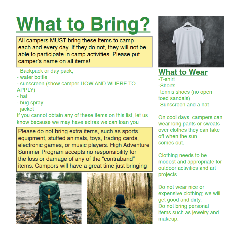
Added yellow sections to display the most important information
Ideate
I gathered data from what I did in the previous phases, First, I made more sketches so I could get to 3 comps. With these comps, I had a critique with fellow graphic designers to narrow down which comp I wanted to select to go further on with the design
Test
During the critique with fellow graphic designers, we were able to narrow out which design to go with
Prototype
I converted the rest of the sketches into compositions for the critique
Composition 1
Composition 2

Composition 3
Final Design

Test
During the critique with fellow graphic designers, we were able to narrow out which design to go with
RETROSPECTIVE
Working on the camp booklet for high adventures was very fun and I learned a lot about the overall experience of designing for print. It was also fun to look at something I have done a couple semesters ago and see how much I have improved now. I wish I could have worked on it more, however due to the time constraints of being a full time graphic design student I did the best I could. I would love to give this another shot because I have even more knowledge now about graphic design. I am proud of what I was able to do considering it was my first attempt at designing for print.